Take Your Front-end Skills to the Next Level: Building an Order Summary Card
" With HTML, SCSS, and a little bit of creativity, you can create a visually appealing and functional card component that can be used in a variety of projects. "

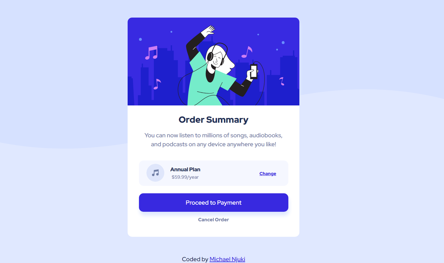
Creating a visually appealing and functional card component can be a challenging task, especially for those new to web development. However, with the right tools and a bit of creativity, it's definitely doable. Recently, I completed a front-end mentor challenge where I had to design and build an order summary card using HTML and SCSS. If you’re new or even experienced in web development stick around to learn from my experience.

The challenge was to create a responsive design that would work well on different screen sizes, as well as make sure that the card followed the style guide and match the design provided. To accomplish this, I decided to focus on creating a simple primary grid and position inner container elements with flexbox.
One of the main challenges I faced while working on the project was getting the layout just right. I wanted to make sure that the spacing and size of every element matched the design to the pixel, so I spent a lot of time experimenting with different layouts and designs. In the end, I settled on a design that featured a container for the image on top, and a container for the order details below it. This design is pretty common and for good reason. It makes the product stand out and make it the focal point of the card, while still making it easy for users to see the important details about their order.
Another challenge I faced was ensuring that the card was responsive and looked good on different screen sizes. I had to make sure that the layout was flexible enough to adapt to different devices, while still looking great. So in the design, I noticed that the height of the card didn’t change for wider screens but the width changed slightly, and the background patterns also changed. So I just had to implement the design without deviating too much. Although I made a few stylistic choices to improve upon the design.
One thing that I really enjoyed about this project was the opportunity to work with SCSS, here's a link to get you started on SCSS. It is a CSS pre-processor that allows you to use variables, nested rules, and other advanced features that make it easier to write and maintain CSS. Let me explain. SCSS, or Sassy CSS, extends the capabilities of traditional CSS. It allows developers to write code in a more organized and maintainable manner by adding features like variables, mixins, and nested rules.
In the context of the order summary card project, SCSS was particularly useful because it allowed me to easily keep track of the various styles and sizes I used throughout the project. Using variables meant that I could store values like colors and font sizes in one place and then reference them in multiple places throughout the project. This made it much easier to make changes to the design since I only had to make updates in one place, rather than having to hunt through the entire CSS file.
Mixins, though I didn't use them for this project, are also a lifesaver. They allow you to reuse a set of styles in multiple places throughout your project, making it much easier to keep your code DRY (Don't Repeat Yourself). This is especially useful for complex styles that you want to reuse in different parts of the project, as it eliminates the need to copy and paste the same code in multiple places. To learn more about variables and mixins here's a video that explains these concepts.

Nested rules are another great feature of SCSS. They allow you to write styles for HTML elements that are contained within other elements, without having to write long, complicated selectors. For example, you can write styles for all the <p> elements within a specific <div>, and the styles will only apply to those specific <p> elements. This makes it much easier to write and maintain CSS since you don’t have to worry about conflicting styles.
I completed this challenge in half a day since it was straightforward and my experience with CSS made it easier to visualize how the majority of the elements should be styled. And although this was a simple task, it made me reflect on a few fundamental points that I like to remind myself of when designing a component:
- The first thing, keep it simple: A card component should be simple and easy to understand. Avoid using too many colors, fonts, or images. Stick to two fonts and monochromatic palettes if you are bogged down by choice.
- Use whitespace effectively: Use whitespace to separate different elements within the card and to create a clean and visually appealing design.
- Use typography effectively: Choosing the right font is a make or break, so pick fonts that are easy to read and that fit the overall design of the card.
- Make it responsive: Make sure the card component is responsive and looks good on different screen sizes and devices.
- Test, test, test: Test the card component on different devices and screen sizes to ensure it looks good and works well. Chrome dev tools give you helpful tools to do this right within the browser.
Overall, the front-end mentor challenge was a great learning experience for me. I got to flex my CSS skills, pun intended, and I’m now much more confident in my ability to create responsive designs that look great on different devices. If you're new to Sass, here's a youtube video that gives you training wheels to get you up and running.
In conclusion, building an order summary card is a great way to take your front-end skills to the next level. With HTML, SCSS, and a little bit of creativity, you can create a visually appealing and functional card component that can be used in a variety of projects. By using SCSS, you can write organized, maintainable, and reusable code that will save you time and make it easier to make changes to your design. The key takeaway from this article is that SCSS is a powerful tool for styling web pages, and by building an order summary card, you can start to see how it can help you improve your front-end skills and become a more confident and efficient developer. Whether you're a beginner or an experienced developer, I hope this article has inspired you to give SCSS a try and start building your own amazing order summary card.
Thanks for reading. I hope you found this post helpful. If you have any questions or feedback, please leave a comment below or reach out to me on Twitter. I would love to hear from you and answer any questions you may have.
