I used Notion for years before I understood why it worked

I've been building frontends for a while now. React components, design systems, responsive layouts. But it wasn't until I started studying Human-Computer Interaction this semester that I finally had the words for something that had been nagging at me: why does Notion feel so different from everything else I use?
This isn't a Notion tutorial. I'm trying to reverse-engineer why a tool I open every day somehow never annoys me (well, not never).
The blank page dread
Most productivity apps hit you with a dashboard full of buttons, menus, and onboarding flows the second you sign up. Notion gives you a blank page and a blinking cursor.
That should be terrifying. No structure, no guidance, just white space. But it isn't.
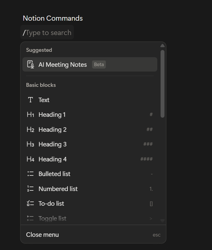
I think the reason traces back to something Notion's co-founder Ivan Zhao baked into the product from the start: the metaphor of a blank sheet of paper. Paper doesn't tell you what to write. It doesn't shove you into a template. But you also don't freeze up staring at it, because you already know how paper works. Notion borrows that familiarity and hides computing power underneath. Type a sentence, hit `/`, and you get over 500 block types. But only when you ask.
In HCI, this is called progressive disclosure. Show people what they need when they need it, not before. That's why Notion can be absurdly powerful and still feel clean.
Six dots that changed how I think about consistency
Something I never consciously noticed until this semester: every block in Notion has a six-dot drag handle that shows up when you hover over it.
Every single one. Text, headings, images, database rows, embeds. Same handle, same position, same behavior.
Don Norman would call that a signifier. A perceivable cue that tells you what you can do. That six-dot icon says "you can move me" and it says it the same way everywhere in the app.
I've built drag-and-drop interfaces myself. I know the temptation. A fancy grab animation for cards, a special resize handle for images, a different cursor for table rows. Notion doesn't do any of that. One signifier, one behavior, full stop. Users learn it once and it transfers to every block they touch.
That kind of restraint is something I'm actively trying to bring into my own component work now.
What you don't see matters more
Zhao talks about a Japanese concept called "ma," the intentional use of empty space. His goal: strip away everything that shouldn't be there until what's left feels inevitable.
I used to think minimalism meant fewer features. Notion broke that for me. It has databases, Kanban boards, calendars, wikis, formulas, rollups, relations, an API, and now AI bolted on. That is not minimal.
But the interface is. Features live behind slash commands, hover states, contextual menus. The toolbar doesn't compete for your attention. The sidebar collapses. Toggles hide content until you expand them.
There's a difference between visual minimalism and functional minimalism. Notion only practices the first kind. Once I saw that, it changed the question I ask when I'm building something. I stopped asking "should we add this feature?" and started asking "where does this feature live until someone needs it?"
The intoxicated user test
This one's my favorite. Notion's team has this internal heuristic: the
"intoxicated user test."
If someone who isn't fully paying attention can still figure out the main flow, your design works.
Sounds ridiculous. But it's a surprisingly sharp filter. It forces you to get the golden path right, the thing 80% of people actually do, before you burn time on edge cases.
I've been guilty of the opposite. Spending hours on error states and empty states while the core interaction still felt off. Notion's philosophy is basically: if the main thing doesn't feel effortless, nothing else matters yet.
What I'm bringing back to my own work
Studying HCI while actively building frontends created this loop I didn't expect. I read about affordances in a lecture, open Notion afterwards, and suddenly I see them everywhere. I read about state models and start diagramming my components differently.
A few things that stuck:
Consistency beats cleverness. One drag handle everywhere is better than five custom ones. Progressive disclosure isn't hiding features, it's respecting attention. Show things when they're relevant, not just because they exist. And empty space is pulling its weight. What you leave out of the viewport matters.
Where this leaves me
I've used Notion nearly every day for years without once thinking about why it felt good. Took an HCI course to hand me the vocabulary: signifiers, progressive disclosure, conceptual models, negative space.
The irony isn't lost on me. I build interfaces for a living and I didn't have those words until now. But I can't unsee it anymore. Every app I open, I'm mentally picking apart what works and what doesn't.
If you write frontend code and you've never formally studied design, give it a shot. Not to become a designer, but because once you understand why something feels right, you start building things that feel right too.
And you can't really learn that from reading docs.